About
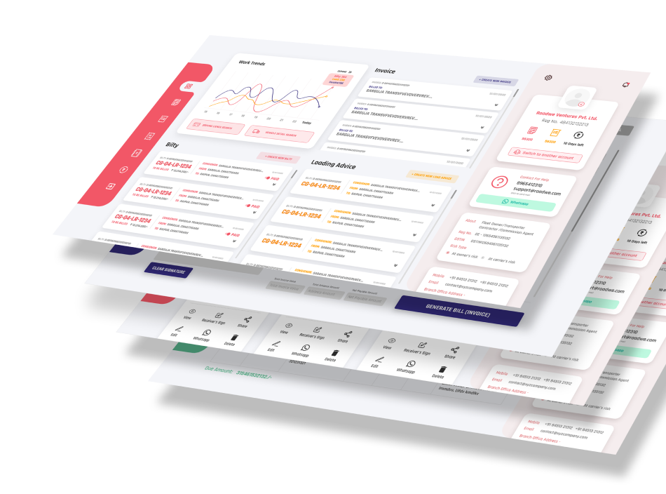
RoadWe is a unique logistics management Android and web-based application that aims to digitize the creation and sharing of transport bilty and invoices. I landed up on this startup’s project during my employment at Sampark Infoways. The is my longest project so far and provided me with great industry knowledge.
Web & Mobile Application
Startup project
Sampark InfowaysFeb 2020 - Feb 2021
My roles and responsibility
Project lead, UX & Visual Designer
My responsibilities in Roadwe project as a project head were to plan and execute the project. Client briefing, day to day reporting & track, and team management were also part of the job. As a UX designer, counducting user research, market analysis, incorporating UI trends and working on user feedback were also my resposibilities.
The Challenge
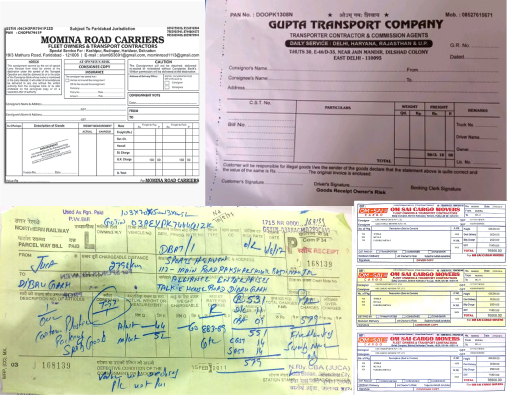
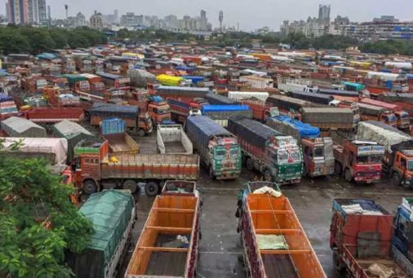
Transportation industry is one of the very unorganised models of business in India. Each transaction requires a heavy amount of paperwork at multiple stages. Due to this, stakeholders face issues in maintaining and sharing the documents among other stakeholders.
The need of the hour is to create an easy, secure & accessible solution to digitalize the entire process of Documentation(Bilty, Invoice & Ledger) and sharing among stakeholders.
Client Briefing
The client was a non-technical guy from the Transportation Industry itself, but was such a visionary to come up with an idea like that. My boss and I were really amazed with the idea and were very excited to work on it. After a few meetings we were onboard and we kick started the work in March 2020. But then happened the mightiest of all, the historical Janta Curfew. So we continued the work in online mode.
As it was a startup idea, the client had already conceptualised the product and had an almost clear vision for it. The client had created the app screens on the PowerPoint which he shared during the client briefing for us to understand better.
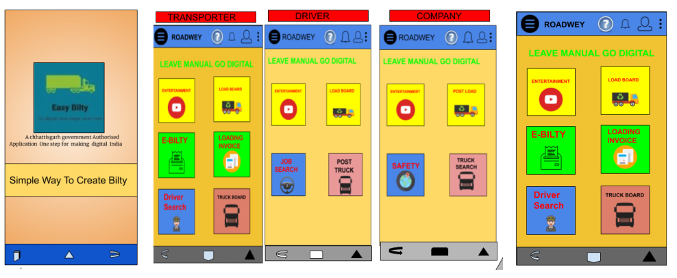
As I knew nothing about the respective industry, this briefing and these concept screens helped me a lot understanding the depth of the problem and the limitations with the industry. This knowledge supported to my secondary research.
Lots of field, Loads of papers
For each shipment there is at least 1 bilty, 1 load advice and 1 invoice which is filed and has to be shared with other participants in the process in various phases. If the shipments have a checkpoint then respectively the number of documents increases, resulting in a pile of documents for one shipment. Usually there are 10-20 trucks with 2-5 checkpoints for one shipment.
Daily life of transporters
The people in the industry are from various backgrounds and are from various levels. From the uneducated to highly educated, all kinds of people have to carry out similar tasks. As being a not defined industry approaching ‘one fits for all’ can be really problematic. Inclusivity is crucial in this case.
User research & analysis
Key Personas
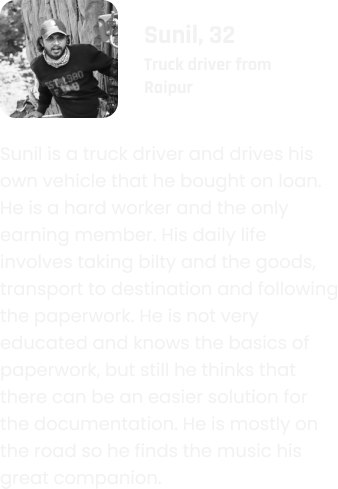
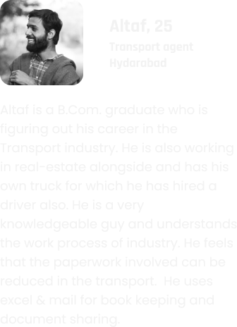
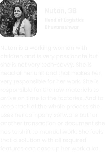
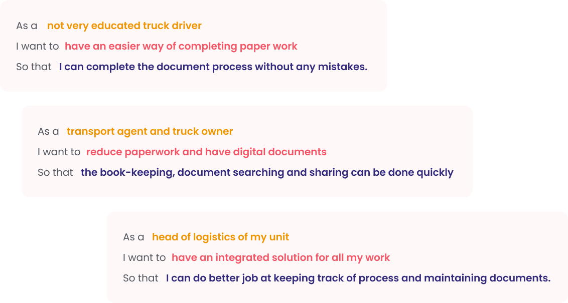
User stories
Designing the user experince
Phase 1 : Initial design and app build
Wireframes for web app:
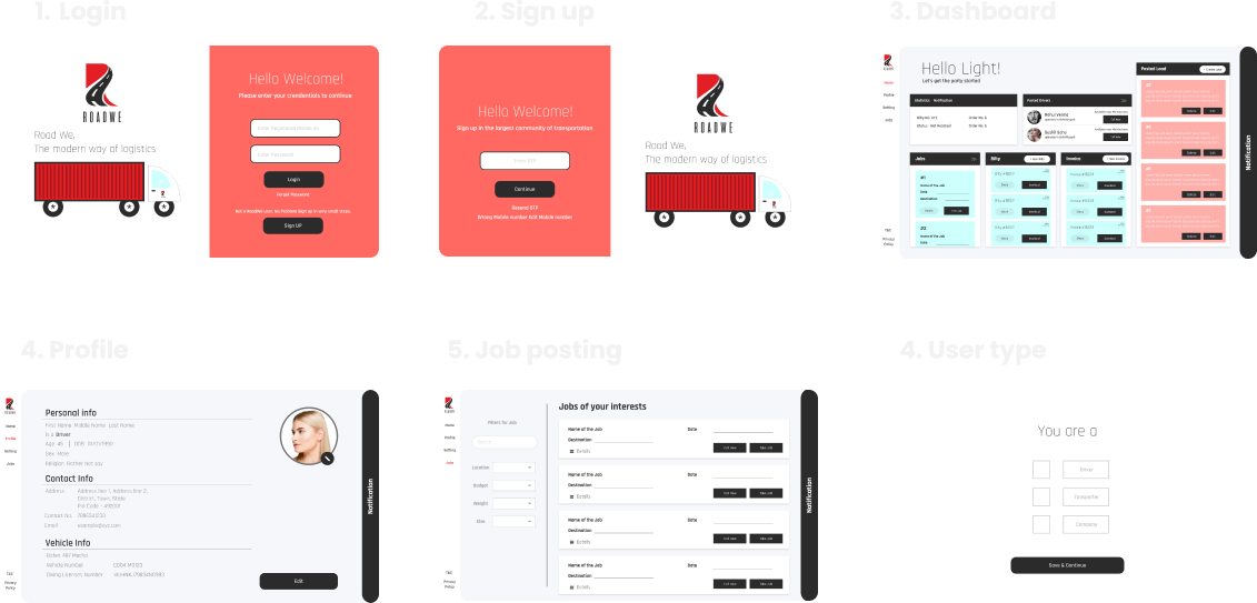
First phase of design
35+
Android app screen
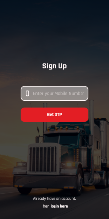
Sign up
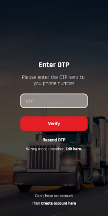
Enter OTP
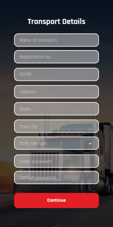
Fill details
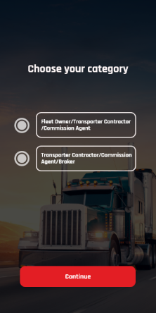
Select user type
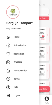
Side navigation
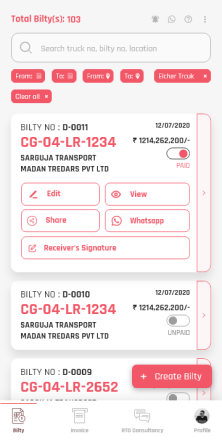
Bilty listing
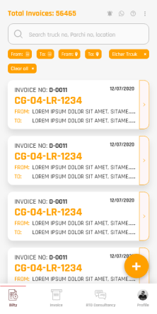
Invoice listing
Consultant list
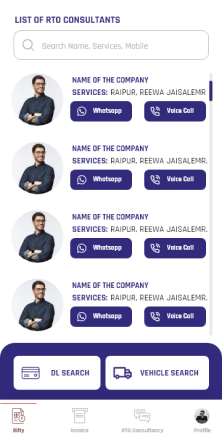
And we launched the app as it was and I was working parallel for web app interface design. Till the time the web-app developed, we already had the app in the Google Play Store and started receiving reviews through mails, personal connections and our team also.
Phase 2 : Web app and user feedback
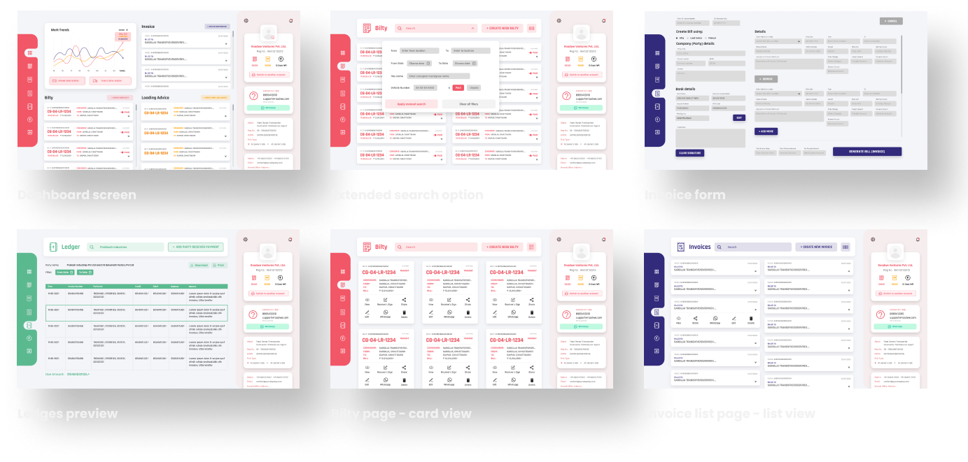
Phase 3 : Final app changes and interface redesign
Unique android app screens created Along with multiple states, and micro-interactions50+
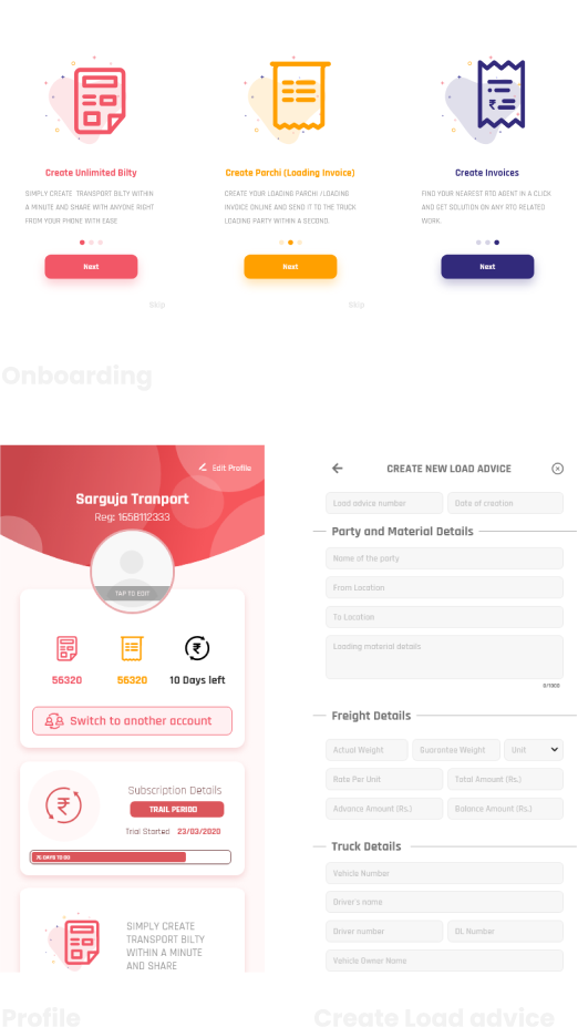
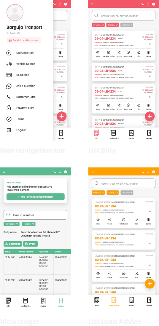
Key features
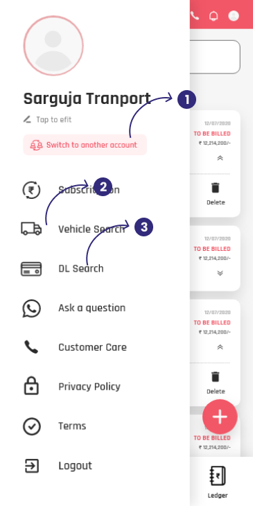
1. Multi user accounts
2. Vehicle Details Search
3. Driving Lience Search
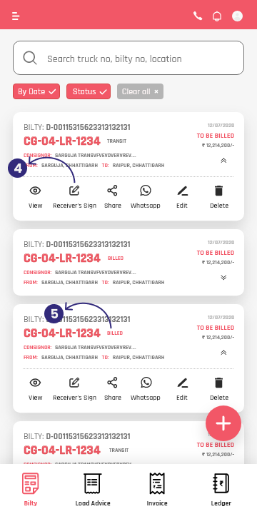
4. In-app receiver sign
5. Automated system for billing transit and billed notification
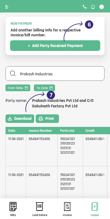
6. In-app book keeping for all the transactions.
7. download in the industry standard format and share
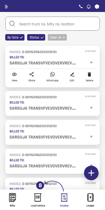
8. integrate all the related documents for one transaction into one invoice
The result
5,000+
User accounts were created by Feb 2021 and still counting…!
